Split Views
The two-pane sidebar/content <splitview> (see Windows & Chrome)
extends to a third pane, list, for the folders/list/content shape Notes, Mail, and Files share:
a source list on the left, a filtered list of items in the middle, a detail view on the right.
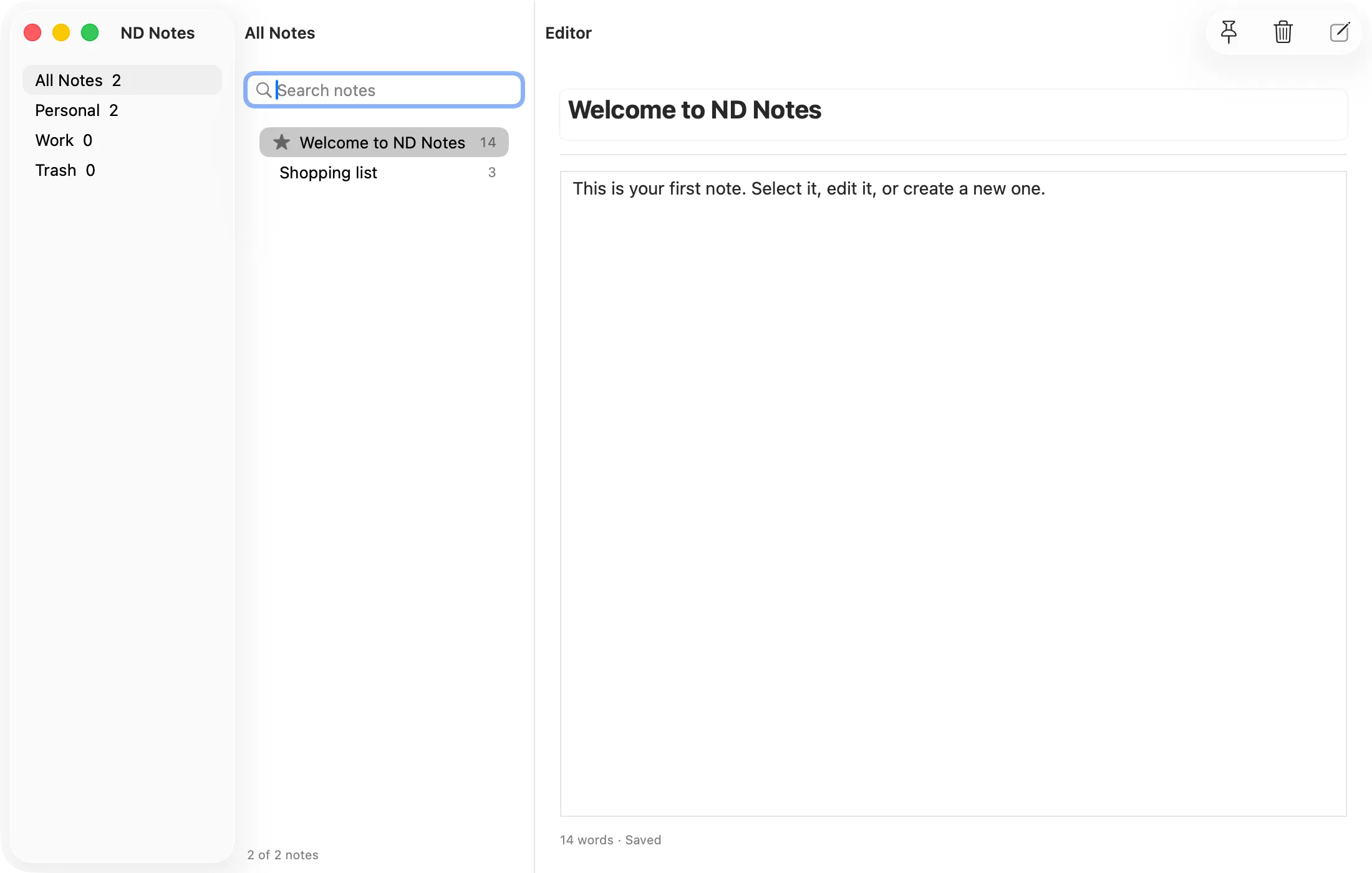
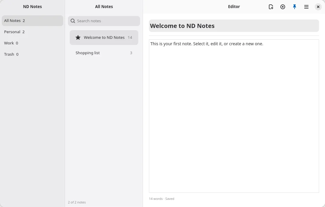
Panes are still distinguished by the slot attached prop, now with a third value:
<splitview sidebarWidth={0.25} listWidth={0.3}>  <toolbarview slot="sidebar">    <headerbar title="Folders" />    {/* folder rows */}  </toolbarview>
  <toolbarview slot="list">    <headerbar title="Notes" />    {/* list rows */}  </toolbarview>
  <toolbarview slot="content">    <headerbar title="Editor" />    {/* detail pane */}  </toolbarview></splitview>
(Adapted from examples/notes/threepane-probe.tsx, the headless acceptance fixture.) The list
slot is additive: a <splitview> with only sidebar and content children behaves as before.
sidebarWidth and the new listWidth are both create-only fractions setting each split’s initial
proportion; collapsed remains live-updatable. See the Widget Reference
for the full prop table.
breakpoint (int, pixels, create-only, 0 means off) collapses the sidebar automatically once the
split’s own width drops below it, independent of collapsed, then restores whatever collapsed last
said once the width climbs back past it: GTK via an AdwBreakpoint on the split’s max-width
condition, AppKit via NDSplitViewController.applyBreakpoint, which adds an 8pt hysteresis band
around the threshold so a divider drag or a live resize can’t toggle the sidebar on every pixel at
the boundary.
Platform rendering
Section titled “Platform rendering”macOS: NSSplitViewController with three items
Section titled “macOS: NSSplitViewController with three items”Each pane becomes an NSSplitViewItem on the same NSSplitViewController (see
Windows & Chrome for why that API is what gives the sidebar its
Liquid Glass material):
sidebar→NSSplitViewItem(sidebarWithViewController:), the glass-treated source list.list→NSSplitViewItem(contentListWithViewController:), a contentList column.content→ a default split item, the detail pane.
The unified NSToolbar splits per divider: with three panes there are two
NSTrackingSeparatorToolbarItems, one per divider. Each pane’s headerbar items land in their
own section of the one toolbar spanning the window’s top edge, the same idiom as the two-pane case.
GNOME: nested AdwOverlaySplitViews
Section titled “GNOME: nested AdwOverlaySplitViews”GTK builds this as two nested AdwOverlaySplitViews: the outer split’s sidebar is the sidebar
pane, and its content is an inner split whose sidebar is the list pane and whose content is the
content pane. Same nesting GNOME Files uses. Each pane keeps its own <toolbarview> and
<headerbar>, so you get three independent per-pane headers rather than one shared bar.
Caveat: initial sizing is floor-dominated on macOS
Section titled “Caveat: initial sizing is floor-dominated on macOS”sidebarWidth and listWidth set the initial split proportion, but on macOS each pane carries a
hard minimumThickness: 180pt for the sidebar item, 240pt for the list (contentList) item. Those
floors win over the fraction whenever the window is narrow enough that the fraction asks for less.
A small listWidth such as 0.15 will not render a genuinely narrow list column at typical window
widths. Measure against the 240pt floor before relying on an exact initial pixel width.
Tiling panes: PaneTree / usePaneTree
Section titled “Tiling panes: PaneTree / usePaneTree”<splitview> is the app-frame shape. For user-driven tiling (terminal splits, editor panes,
anything the user splits and closes at will), use @nativedesktop/panes (packages/panes/): a pure
model plus a component over the existing <paned> widget. No new widget, no schema or ABI change.
Each split renders as a real native GtkPaned or NSSplitView with a draggable divider.
import { PaneTree, seedPanes, usePaneTree } from "@nativedesktop/panes";
function Editor(): React.ReactNode {  const panes = usePaneTree(seedPanes([{ file: "notes.md" }]));  return (    <PaneTree      model={panes.model}      onChange={panes.setModel}      renderLeaf={({ id, data, focused, solo }) => (        <box orientation="vertical">          <label text={`${data.file}${focused ? " (focused)" : ""}`} />          <button label="Split" onClick={() => panes.split(id, "horizontal", { file: "new.md" })} />          {!solo && <button label="Close" onClick={() => panes.close(id)} />}        </box>      )}    />  );}
The model is a strictly binary tree (PaneLeaf | PaneSplit) with pure ops: splitPane,
closePane, focusPane/focusPaneAt/focusNeighbor, setPaneRatio, updatePane, paneLeaves,
samePaneShape, and migratePanes for reviving persisted state (garbage in, empty model out).
Every op returns the same reference when nothing changed, which stops the native positionChanged
echo after a programmatic ratio write from looping a render and persist cycle. Ratios are clamped to
[0.05, 0.95] (clampPaneRatio), non-finite input becomes 0.5, and echoes at or beyond the clamp
bounds are dropped as mid-layout noise, since a settled drag cannot reach them past the backends’
native minimum pane extents.
usePaneTree holds the model in state and applies every op against a ref rather than the
render-time model, so an await-resuming split cannot revert a divider drag that happened in
between. latest() exposes that ref for persistence. renderLeaf owns all per-pane chrome (focus
ring, toolbar); PaneTree supplies focused and solo plus one expanding <box> wrapper per
leaf. Splits are keyed on the split node’s id because orientation is create-only on both backends,
so a structural collapse landing a different split at the same position remounts instead of
mutating.
Persist the model with createStore: store.set(panes.latest())
on change, flush() when samePaneShape says the change was structural. examples/panes/ is the
worked example (and the headless acceptance fixture, scripts/headless-panes.sh).
Automation
Section titled “Automation”Three-pane trees expose the same getTree/click contract as any other widget nesting (see
Automation Socket). Each pane’s rows are ordinary nodes
at their real geometry, so an automation script can assert x-order across panes (a sidebar row
sits left of a list row, which sits left of the content pane) the same way it would for the
two-pane layout.