Composition Components
@nativedesktop/ui (packages/ui/) is a composition layer over widgets that already exist: every
component here renders ordinary intrinsics (<box>, <row>, <button>, <expander>…) and holds
no state of its own beyond what a controlled prop gives it. Nothing in this package touches
schema/widgets.json or the ABI, the same precedent @nativedesktop/panes set for PaneTree (see
Split Views). Install it as a workspace dependency and import from
@nativedesktop/ui; it peer-depends on @nativedesktop/react.
Accordion
Section titled “Accordion”A stack of Expanders, one per item, with
expandedIds as controlled state. allowMultiple (default false) decides whether opening one
item closes the others.
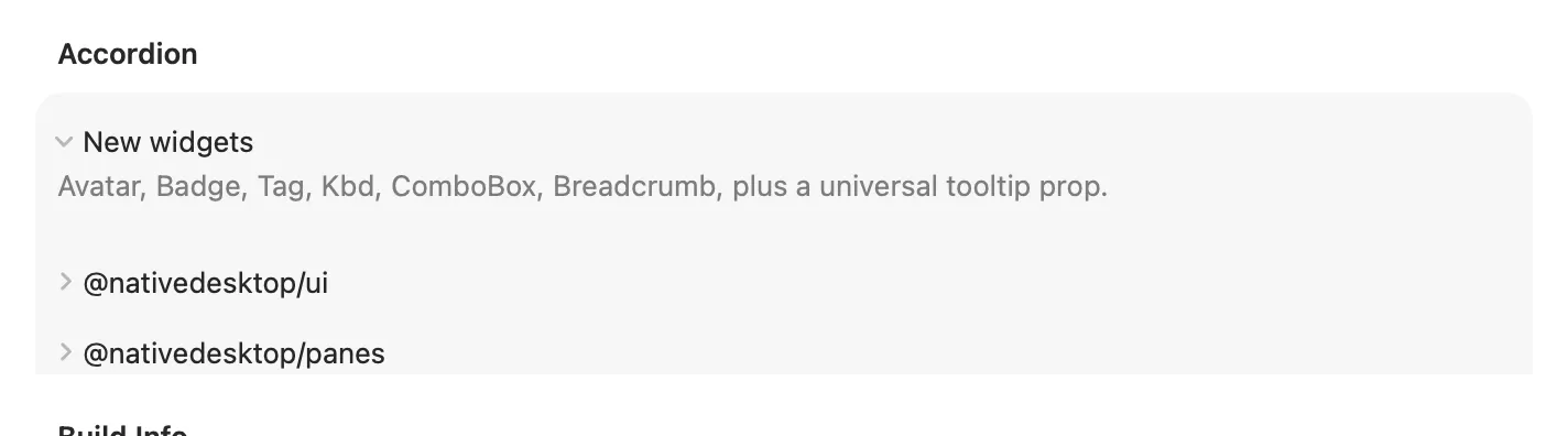
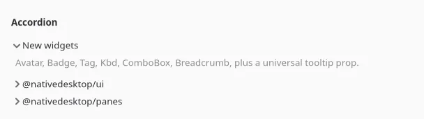
const [expandedIds, setExpandedIds] = useState<string[]>(["intro"]);
<Accordion items={[{ id: "intro", label: "Introduction", content: <label text="..." /> }]} expandedIds={expandedIds} onExpandedChange={setExpandedIds}/>;| Prop | Type | Notes |
|---|---|---|
items |
{ id, label, content: ReactNode }[] |
|
expandedIds |
string[] |
Controlled: ids of the currently open items. |
onExpandedChange |
(ids: string[]) => void |
|
allowMultiple |
boolean | Default false: opening one item closes the others. |
nextExpandedIds (also exported) is the pure function behind onExpandedChange’s computation, if
you need the same open/close logic somewhere that isn’t an Accordion.
DescriptionList
Section titled “DescriptionList”A <settingsgroup> of <row>s in .property style, for read-only key/value pairs: build info,
account details, a summary screen. No interaction, no events.
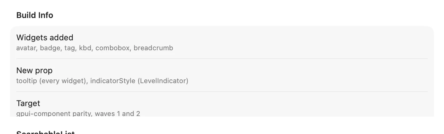
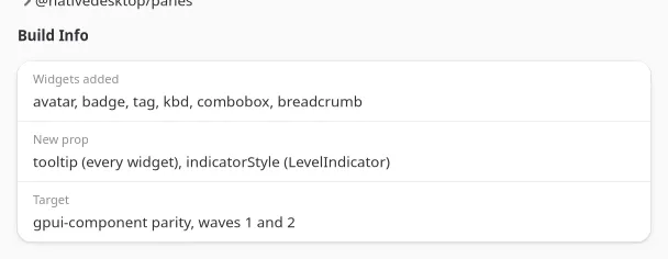
<DescriptionList title="Build Info" items={[{ label: "Version", value: "0.1.2" }]} />;| Prop | Type | Notes |
|---|---|---|
items |
{ label, value }[] |
|
title |
string | Optional group heading. |
Pagination
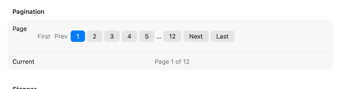
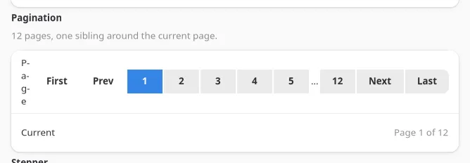
Section titled “Pagination”A linked row of page buttons (First/Prev, numbered pages with an ellipsis gap, Next/Last), windowed around the current page.
const [page, setPage] = useState(1);
<Pagination page={page} pageCount={12} onPageChange={setPage} />;| Prop | Type | Notes |
|---|---|---|
page |
number | Controlled, 1-based. |
pageCount |
number | Pagination renders nothing when pageCount <= 0. |
onPageChange |
(page: number) => void |
|
siblingCount |
number | Pages shown on each side of the current page before collapsing to …. Default 1. |
computePaginationRange (also exported) is the pure windowing function, useful for testing a custom
pager or rendering the range some other way.
Stepper
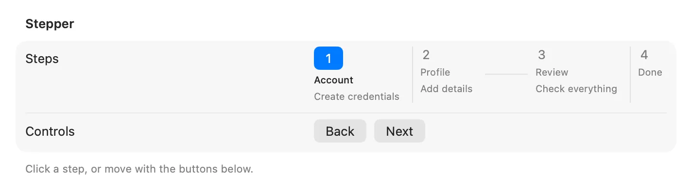
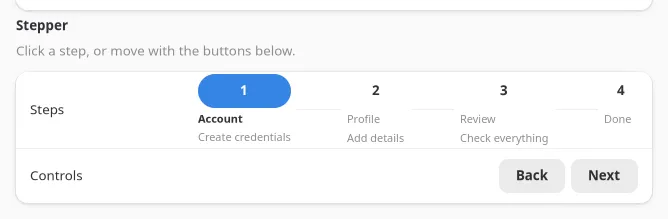
Section titled “Stepper”A horizontal row of numbered circles and separators for a multi-step flow, each step’s state
(completed / active / pending) derived from activeIndex.
const [step, setStep] = useState(0);
<Stepper steps={[{ id: "account", title: "Account" }]} activeIndex={step} onStepClick={setStep} />;| Prop | Type | Notes |
|---|---|---|
steps |
{ id, title, description? }[] |
|
activeIndex |
number | |
onStepClick |
(index: number) => void |
Optional. Omit to make the steps display-only. |
stepState (also exported) is the pure index, activeIndex -> "completed" | "active" | "pending"
function.
HoverCard
Section titled “HoverCard”A <popover> that opens after a hover delay and closes after a leave delay, anchored to its
children.

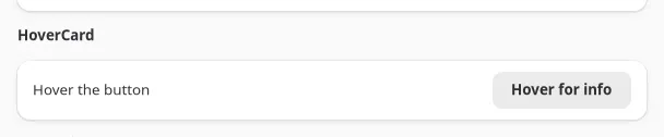
<HoverCard content={<label text="Extra detail." />}> <button label="Hover for info" /></HoverCard>;| Prop | Type | Notes |
|---|---|---|
content |
ReactNode | The popover’s body. |
children |
ReactNode | The anchor. |
openDelay / closeDelay |
number (ms) | Default 400 / 200. |
There is no separate hover-enter/hover-leave event on the underlying widget, only one
hoverChanged boolean, so both the open and close timers key off it. A fast pass-through pointer
never flashes the card open, since the open timer is cleared before it fires.
SearchableList
Section titled “SearchableList”A <searchinput> over a <listview>, filtered client-side as the user types.
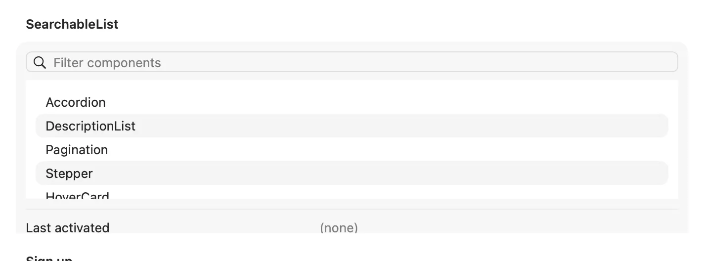
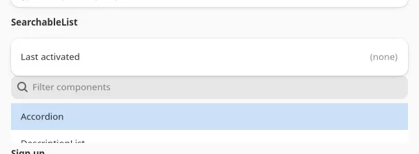
<SearchableList items={[{ id: "a", label: "Apple" }]} onActivate={(item) => console.log(item.label)} placeholder="Filter"/>;| Prop | Type | Notes |
|---|---|---|
items |
{ id, label }[] |
|
onActivate |
(item) => void |
Fires on row activation (double-click / Enter), matching ListView’s own event. |
filter |
(item, query) => boolean |
Overrides the default case-insensitive label match. |
placeholder, emptyIconName, emptyTitle, emptyDescription |
string | Passed straight through to searchinput/listview. |
defaultFilter and filterItems (also exported) are the pure matching functions.
Form and FormField
Section titled “Form and FormField”Form is a titled <settingsgroup>; FormField is a <row> that shows error (styled with the
error cssClass) in place of hint when a field fails validation, and puts its children in the
row’s control slot.

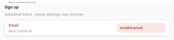
const [email, setEmail] = useState("");const error = email.length > 0 && !email.includes("@") ? "Must contain @" : undefined;
<Form title="Sign up"> <FormField label="Email" error={error} hint="We'll only use this for updates"> <textinput text={email} onChanged={(e) => setEmail(e.text)} /> </FormField></Form>;| Component | Prop | Type | Notes |
|---|---|---|---|
Form |
title, description |
string | |
FormField |
label |
string | |
FormField |
error |
string | Shown instead of hint when present; adds the error cssClass to the row. |
FormField |
hint |
string | Shown when there is no error. |
Validation itself is app logic; Form/FormField only render the state you compute.
OtpInput
Section titled “OtpInput”length single-character <textinput> cells (.numeric cssClass) for a verification code, with
auto-advance on entry and paste-fill across cells handled for you.

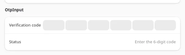
const [code, setCode] = useState("");
<OtpInput length={6} value={code} onChange={setCode} onComplete={(v) => console.log("done", v)} />;| Prop | Type | Notes |
|---|---|---|
length |
number | Default 6. |
value |
string | Controlled. |
onChange |
(value: string) => void |
|
onComplete |
(value: string) => void |
Fires once value.length === length. |
otpCellChanged and otpChars (also exported) are the pure per-cell edit and padding functions.
Caveat: there is no focus command on <textinput> in the current widget ABI, so a completed cell
cannot move the caret to the next box programmatically. Every cell stays editable so a user typing
out of order is never blocked, but auto-advance is visual only, not a real focus move.
ButtonGroup
Section titled “ButtonGroup”A linked row of buttons, either a plain action group or, with selectedId, a single-select toggle
group (the matching button renders prominent).

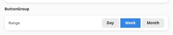
const [range, setRange] = useState("week");
<ButtonGroup items={[{ id: "day", label: "Day" }, { id: "week", label: "Week" }]} selectedId={range} onPress={setRange} />;| Prop | Type | Notes |
|---|---|---|
items |
{ id, label, iconName? }[] |
|
onPress |
(id: string) => void |
|
selectedId |
string | Omit for a plain action group with no selection state. |
StatusBar
Section titled “StatusBar”A three-slot horizontal bar (.toolbar cssClass) for a window or panel’s bottom edge: left,
center, and right each take arbitrary content.


<StatusBar left={<label text="Ready" />} right={<label text="v0.1.2" />} />;| Prop | Type | Notes |
|---|---|---|
left, center, right |
ReactNode | Each renders in its own haligned sub-box; any are optional. |
See examples/parity/main.tsx’s Composition section for all ten components wired to live state.