Data Views
<table>, <treeview>, and <sourcetree> take a plain data prop you own in React state. The
native widget renders exactly what you give it and fires an event when the user wants something to
change. It never reorders or re-nests the data itself.
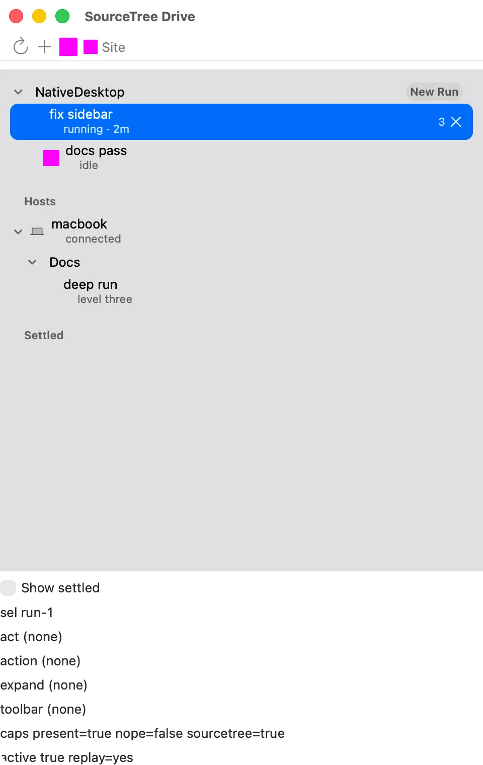
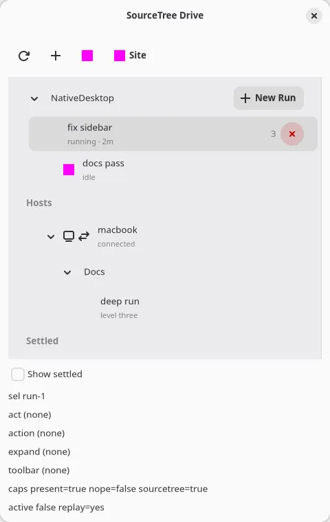
Table (<table>)
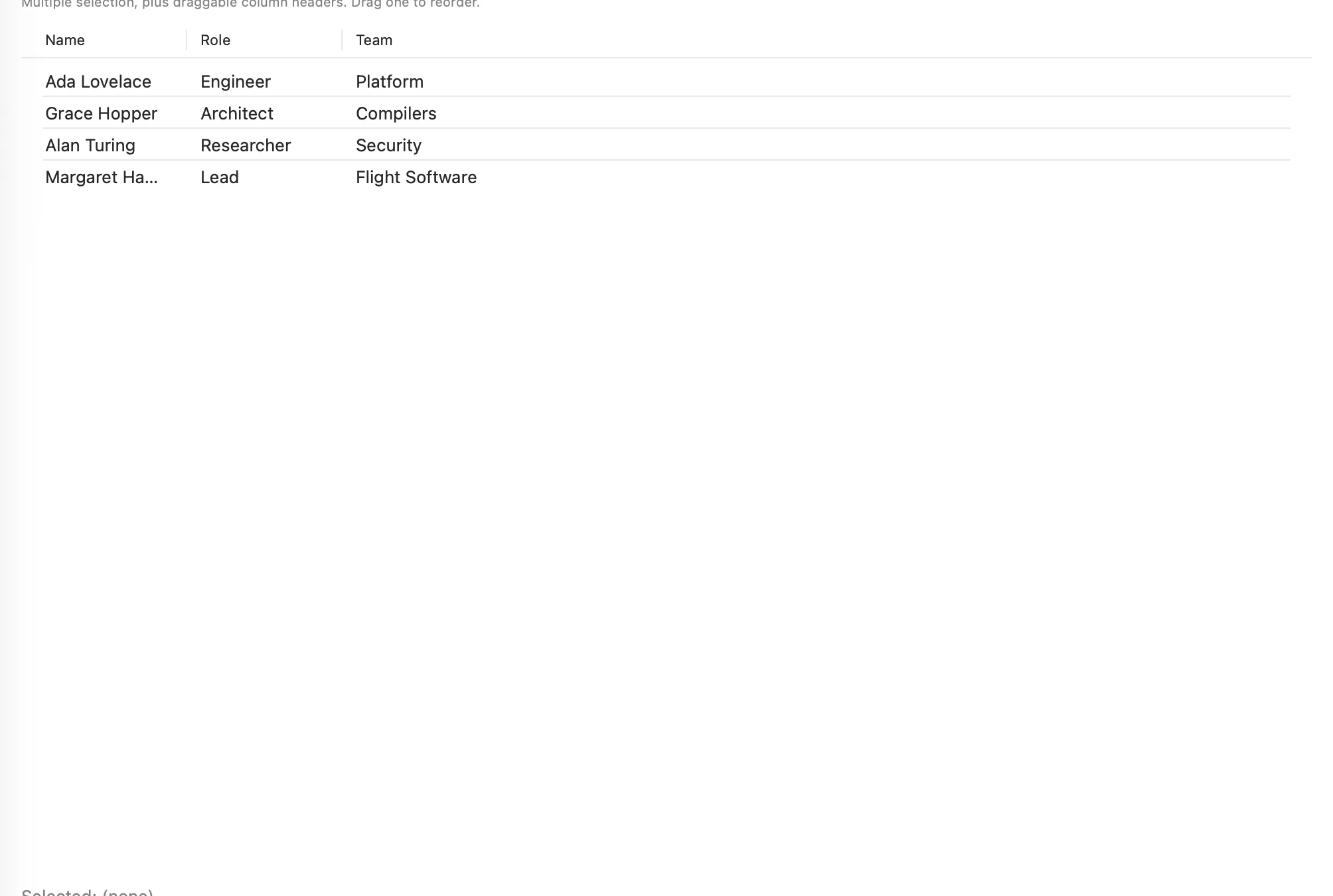
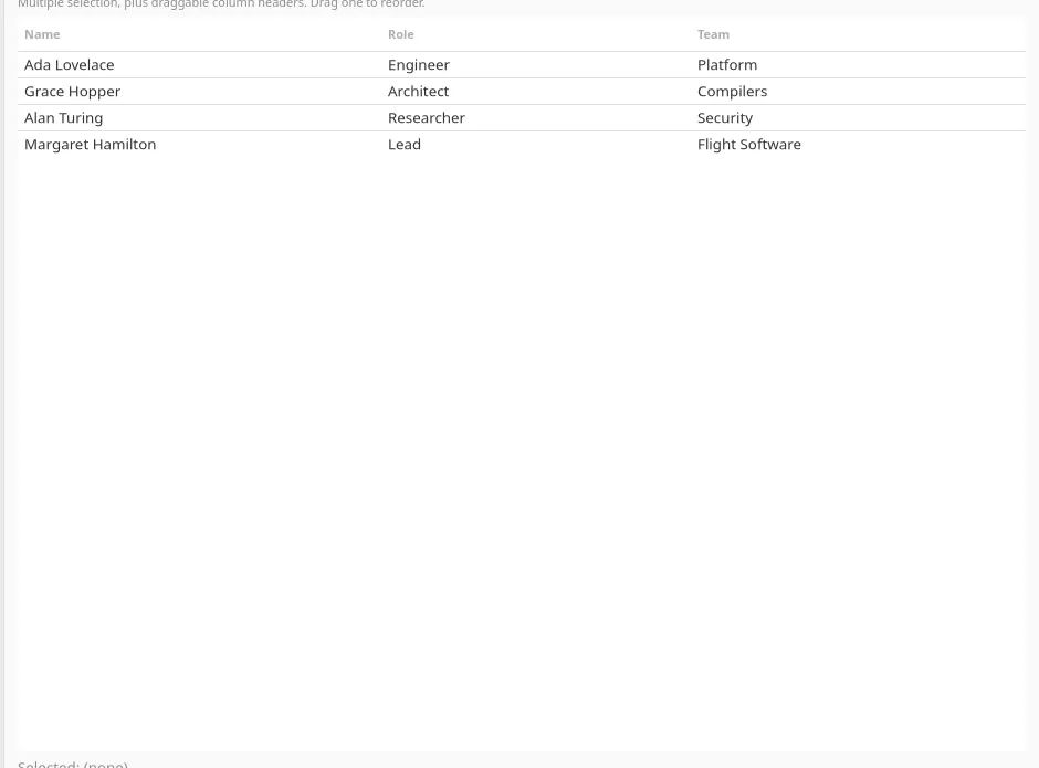
Section titled “Table (<table>)”A multi-column list. GtkColumnView on GTK, NSTableView on macOS. Columns and rows are separate
arrays, so a column resize or reorder never has to touch every row. On macOS the table draws in the
system’s inset style (rounded corners, no alternating row background), matching the macOS 26 Files
and Mail list chrome.
import type { TableColumn, TableRow } from "@nativedesktop/react";
const columns: TableColumn[] = [  { id: "name", title: "Name" },  { id: "role", title: "Role" },  { id: "department", title: "Department", width: 160 },];
function handleSortChanged(e: { data: unknown }) {  const { columnId, direction } = e.data as { columnId: string; direction: "ascending" | "descending" };  setEmployees((prev) => {    const sorted = [...prev].sort((a, b) => {      const cmp = String(a[columnId]).localeCompare(String(b[columnId]));      return direction === "ascending" ? cmp : -cmp;    });    return sorted;  });}
<table columns={columns} rows={employees.map((e): TableRow => ({ id: e.id, cells: [e.name, e.role, e.department] }))} selectedIndex={selectedIndex} onSelectionChanged={(e) => setSelectedIndex(e.index)} onRowActivated={(e) => setActivatedIndex(e.index)} onSortChanged={handleSortChanged}/>;| Prop | Type | Applied | Notes |
|---|---|---|---|
columns |
TableColumn[] |
createAndUpdate | { id, title, width? }. id is echoed back in sortChanged, never shown. |
rows |
TableRow[] |
createAndUpdate | { id?, cells }. cells is positional, indexed by columns’ order. |
selectionMode |
"none" | "single" | "multiple" |
create | Default "single". Create-only: change it by remounting the node (a different key). |
selectedIndex |
int | createAndUpdate | The primary selected row. Default -1. |
selectedIndexes |
number[] |
createAndUpdate | The full selection, meaningful once selectionMode="multiple". |
columnsReorderable |
bool | createAndUpdate | Lets the user drag a column header to reorder it. Default false. |
showRowSeparators |
bool | createAndUpdate | Default true. |
| Event | Handler | Payload |
|---|---|---|
selectionChanged |
onSelectionChanged |
{ index, data: { indexes } }, index the primary row and data.indexes the full selection |
rowActivated |
onRowActivated |
{ index } (double-click / Enter) |
sortChanged |
onSortChanged |
{ data: { columnId, direction } } |
columnsResized |
onColumnsResized |
{ data }, the new column widths |
columnsReordered |
onColumnsReordered |
{ data }, the new column order |
Clicking a column header fires sortChanged and stops there. The widget shows the sort indicator
arrow but does not reorder rows. Sort in your handler and pass the new array back down. Dragging a
header with columnsReorderable set works the same way: the widget fires columnsReordered and
waits for you to feed the new columns order back down, rather than reordering on its own.
With selectionMode="multiple", click a row to select just it and Cmd/Ctrl-click or Shift-click to
extend the selection, same as a native multi-select list. selectedIndexes is the source of truth
for what’s highlighted; keep it in state and read e.data.indexes in onSelectionChanged. See
examples/parity/main.tsx’s Data section.
TreeView (<treeview>)
Section titled “TreeView (<treeview>)”A hierarchical outline. GtkTreeListView/GtkColumnView on GTK, NSOutlineView on macOS. Nodes
are a flat array keyed by id/parentId, not nested objects. Root nodes omit parentId. Draws in
the same inset style as <table> on macOS.
import type { TreeNode } from "@nativedesktop/react";
const nodeMeta: Omit<TreeNode, "expanded">[] = [  { id: "fruits", title: "Fruits", hasChildren: true },  { id: "apple", parentId: "fruits", title: "Apple", hasChildren: false },  { id: "banana", parentId: "fruits", title: "Banana", hasChildren: false },];
const [expanded, setExpanded] = useState<Set<string>>(new Set(["fruits"]));const nodes: TreeNode[] = nodeMeta.map((n) => ({ ...n, expanded: expanded.has(n.id) }));
<treeview nodes={nodes} indentationPerLevel={16} onSelectionChanged={(e) => setSelected((e.data as { nodeId: string | null }).nodeId)} onNodeExpanded={(e) => { const { nodeId } = e.data as { nodeId: string }; setExpanded((prev) => new Set(prev).add(nodeId)); }} onNodeCollapsed={(e) => { const { nodeId } = e.data as { nodeId: string }; setExpanded((prev) => { const next = new Set(prev); next.delete(nodeId); return next; }); }}/>;| Prop | Type | Applied | Notes |
|---|---|---|---|
nodes |
TreeNode[] |
createAndUpdate | { id, parentId?, title, badge?, iconName?, hasChildren, expanded }, flat rather than nested. |
selectedIndex |
int | createAndUpdate | Default -1, indexes the flattened visible rows. |
indentationPerLevel |
int | create | Pixels per depth level, default 16. |
| Event | Handler | Payload |
|---|---|---|
selectionChanged |
onSelectionChanged |
{ data: { nodeId } } |
rowActivated |
onRowActivated |
{ data: { nodeId } } |
nodeExpanded |
onNodeExpanded |
{ data: { nodeId } } |
nodeCollapsed |
onNodeCollapsed |
{ data: { nodeId } } |
Expansion is controlled state, not native state. Track a Set<string> of expanded ids as above and
feed it back into every node’s expanded field, otherwise an unrelated re-render can collapse a
branch the user opened.
SourceTree (<sourcetree>)
Section titled “SourceTree (<sourcetree>)”A hierarchical sidebar: section headers, id/parentId rows with a caption line, badges, and
trailing per-row actions. GTK renders a navigation-sidebar GtkListBox of AdwActionRows, macOS a
.sourceList-style NSOutlineView.
Pick between the three sidebar-ish widgets: <sourcelist> for a flat index-addressed sidebar,
<treeview> for a disclosure tree in a content pane, <sourcetree> for an app chrome sidebar with
structure.
import type { SourceTreeAction, SourceTreeNode } from "@nativedesktop/react";
const actions: SourceTreeAction[] = [  { id: "new-run", iconName: "list-add-symbolic", label: "New Run" },  { id: "close-run", iconName: "window-close-symbolic", tooltip: "Close run", destructive: true },];
const nodes: SourceTreeNode[] = [  { id: "sec-hosts", title: "Hosts", section: true, hasChildren: true, expanded: true },  { id: "host-mac", parentId: "sec-hosts", title: "macbook", caption: "connected",    iconName: "computer-symbolic", hasChildren: true, expanded: true },  { id: "run-1", parentId: "host-mac", title: "fix sidebar", caption: "running · 2m",    badge: "3", actionIds: ["close-run"], testID: "run-row-1" },];
<sourcetree nodes={nodes} actions={actions} selectedId={selectedId} onSelectionChanged={(e) => setSelectedId((e.data as { nodeId: string | null }).nodeId ?? "")} onActionClicked={(e) => { const { nodeId, actionId } = e.data as { nodeId: string; actionId: string }; // ... }}/>;| Prop | Type | Applied | Notes |
|---|---|---|---|
nodes |
SourceTreeNode[] |
createAndUpdate | Flat { id, parentId?, title, caption?, iconName?, iconData?, captionIconName?, badge?, section?, hasChildren?, expanded?, selectable?, actionIds?, testID? }. iconName is a freedesktop icon name; iconData is raw image bytes (a data: URL or bare base64) for icons no theme has, such as a favicon, and wins when both are set. |
actions |
SourceTreeAction[] |
createAndUpdate | The action catalog rows reference by actionIds: { id, iconName, label?, tooltip?, destructive? }. |
selectedId |
string | createAndUpdate | Controlled selection by node id; "" means none. There is no selectedIndex. |
actionVisibility |
"hover" | "always" |
create | Default "hover": action buttons show only while the pointer is over the row. |
indentationPerLevel |
int | create | Pixels per depth level. Unset, each backend uses its native step: 24 on GTK, 14 on macOS. |
| Event | Handler | Payload |
|---|---|---|
selectionChanged |
onSelectionChanged |
{ data: { nodeId } } (nodeId null on deselect) |
rowActivated |
onRowActivated |
{ data: { nodeId } } |
nodeExpanded |
onNodeExpanded |
{ data: { nodeId } } |
nodeCollapsed |
onNodeCollapsed |
{ data: { nodeId } } |
actionClicked |
onActionClicked |
{ data: { nodeId, actionId } } |
Expansion is controlled state, same as TreeView. Events address rows by nodeId because visible
indexes shift under expand and collapse.
Row kinds:
section: trueis a group header. Non-selectable, styled as a native section label. A section withhasChildrenis a collapsible shelf.selectable: falseis an informational row, such as an empty-state line, that is not a header.
There is no hoverChanged event. Hover is the widget’s own native affordance.
Per-node testID surfaces in the automation tree’s rows, so tests target rows without depending
on row order.
Platform differences: GTK draws a manual disclosure arrow per parent row (GtkListBox has no native
outline affordance), reserves that 24px gutter on every row so a parent’s title stays left of its
children’s, paints the sidebar-pane fill when the tree is not already in a split view’s sidebar
slot, and renders captionIconName as a small second prefix icon. macOS sections have no
disclosure triangle (the native source-list group look) and inline the caption icon on the caption
line.
Native empty states
Section titled “Native empty states”<sourcelist>, <listview>, <table>, <treeview>, and <sourcetree> all take three optional
createAndUpdate props: emptyIconName, emptyTitle, emptyDescription. When the item array is
empty and at least one of them is set, the widget shows platform empty-state chrome in place of the
blank list (a compact AdwStatusPage on Linux, a centered icon/title/description stack on macOS),
and swaps the real list back when items return.
<table columns={columns} rows={rows} emptyIconName="folder-open" emptyTitle="No results" emptyDescription="Try a broader filter."/>Leave them unset and no swap ever happens.
See examples/gallery/main.tsx’s Table, Tree, and SourceTree tabs for all three wired to
controlled state, and the Widget Reference for the generated prop
tables.