Display & Navigation
Six widgets added to close the gap with gpui-component:
compact identity and status markers (Avatar, Badge, Tag, Kbd), a searchable picker
(ComboBox), and a path control (Breadcrumb). All six are cross-platform, real native widgets on
both AppKit and GTK/Adwaita, declared in schema/widgets.json like every other widget.
Avatar (<avatar>)
Section titled “Avatar (<avatar>)”A round identity marker (AdwAvatar on GTK, a SwiftUI view on macOS). Give it text and it renders
initials; add imagePath for a photo.
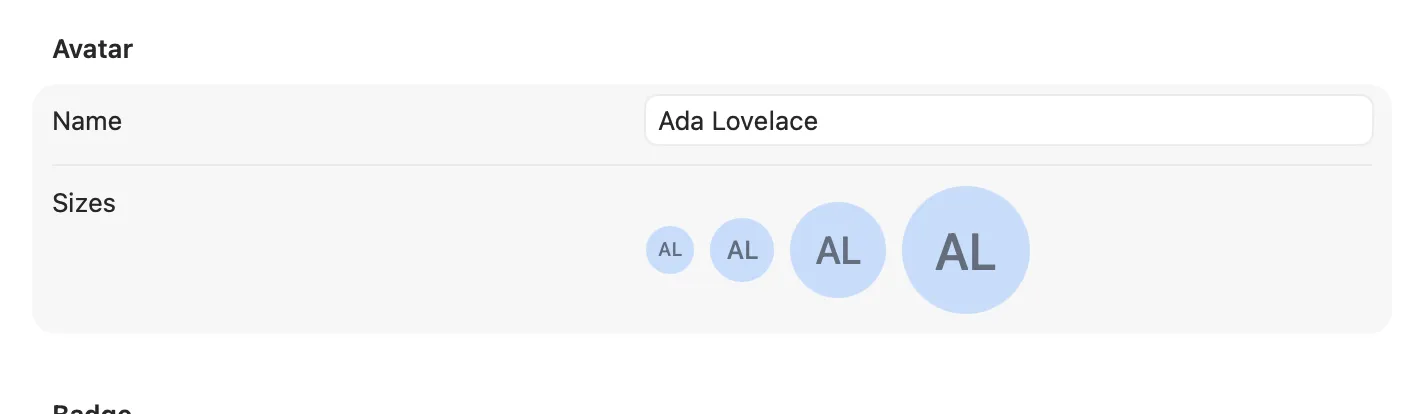
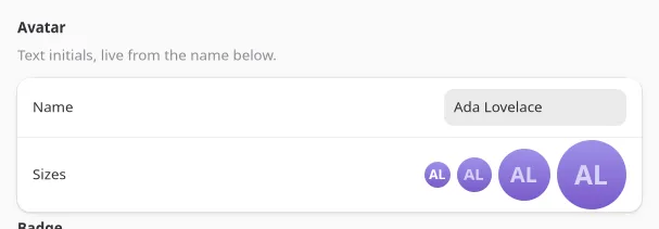
<avatar text="Ada Lovelace" size={48} />;| Prop | Type | Applied | Notes |
|---|---|---|---|
text |
string | createAndUpdate | Source for initials, and the automation tree’s text. |
imagePath |
string | createAndUpdate | Overrides initials with a photo when present. |
size |
int | create | Diameter in points/px. Default 32. |
showInitials |
bool | create | Falls back to a generic placeholder when false and no image. Default true. |
No events. size and showInitials are create-only: change them by remounting the node (a
different key), not by writing new props onto an existing one.
Badge (<badge>)
Section titled “Badge (<badge>)”A small status pill (a GtkLabel with .badge on GTK, a SwiftUI capsule on macOS) for a count
or a state word: “New”, “3”, “Beta”.
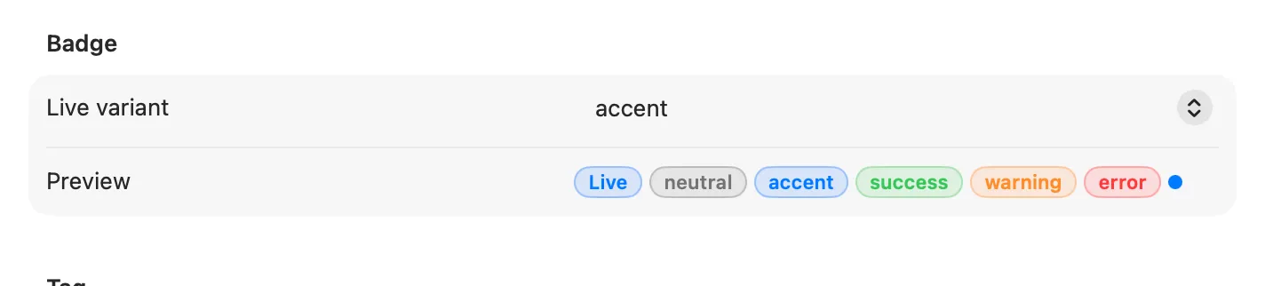
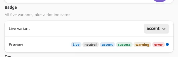
<badge label="Beta" variant="accent" />;<badge dot variant="error" />;| Prop | Type | Applied | Notes |
|---|---|---|---|
label |
string | createAndUpdate | |
variant |
neutral | accent | success | warning | error |
createAndUpdate | Default neutral. |
dot |
bool | create | Renders as a plain colored dot, no label, for an unread/attention marker. |
No events; Badge is read-only. Pair it with a <row> or <button badge> for a count that lives
next to a label.
Tag (<tag>)
Section titled “Tag (<tag>)”A removable chip (GtkLabel with .pill on GTK, a SwiftUI capsule on macOS), for filter chips,
selected-skill lists, and similar small removable-item rows.
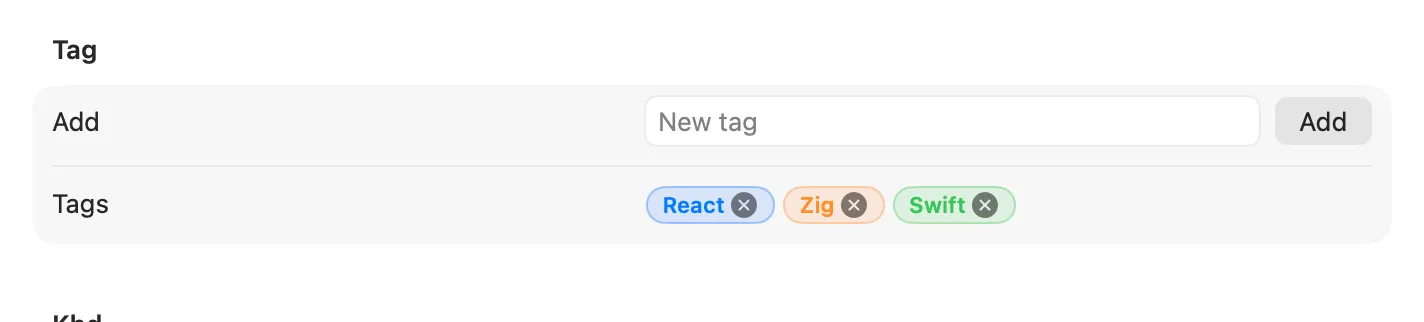
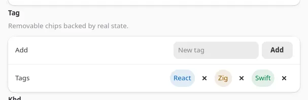
const [tags, setTags] = useState(["React", "Zig"]);
<tag label="React" variant="accent" removable onRemoved={() => setTags((t) => t.filter((x) => x !== "React"))} />;| Prop | Type | Applied | Notes |
|---|---|---|---|
label |
string | createAndUpdate | |
variant |
neutral | accent | success | warning | error |
createAndUpdate | Default neutral. |
removable |
bool | create | Shows the trailing close affordance. |
removed → onRemoved fires with no payload when the close affordance is clicked. The app owns the
list; Tag never removes itself from anything.
Kbd (<kbd>)
Section titled “Kbd (<kbd>)”A keyboard-shortcut label (GtkLabel with .monospace and a frame on GTK, a bordered SwiftUI
keycap on macOS), for showing the accelerator next to the command it triggers.
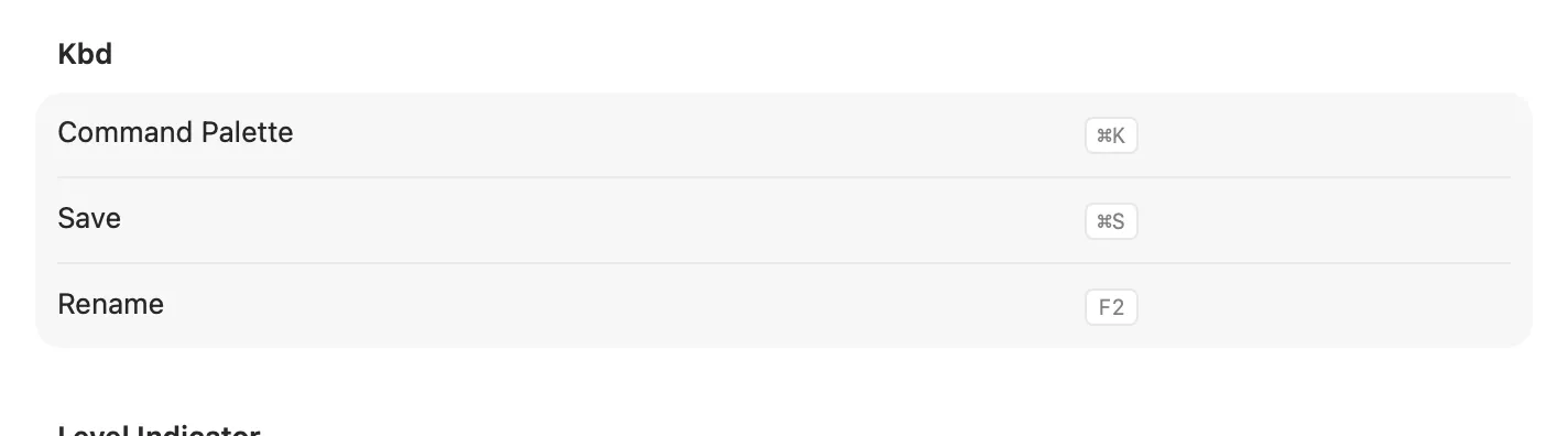
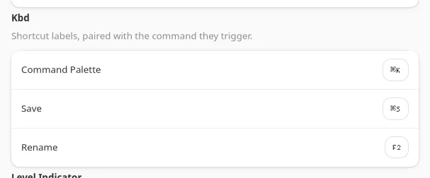
<row title="Command Palette"> <kbd keys="⌘K" /></row>;| Prop | Type | Applied | Notes |
|---|---|---|---|
keys |
string | createAndUpdate | Rendered as-is; format the key combo string yourself ("⌘K", "Ctrl+Shift+P"). |
Display-only, no events. Kbd shows a shortcut; it does not register one. Pair it with a real
accelerator on a <menuitem> (see Menu Bar) if the shortcut should
actually fire.
ComboBox (<combobox>)
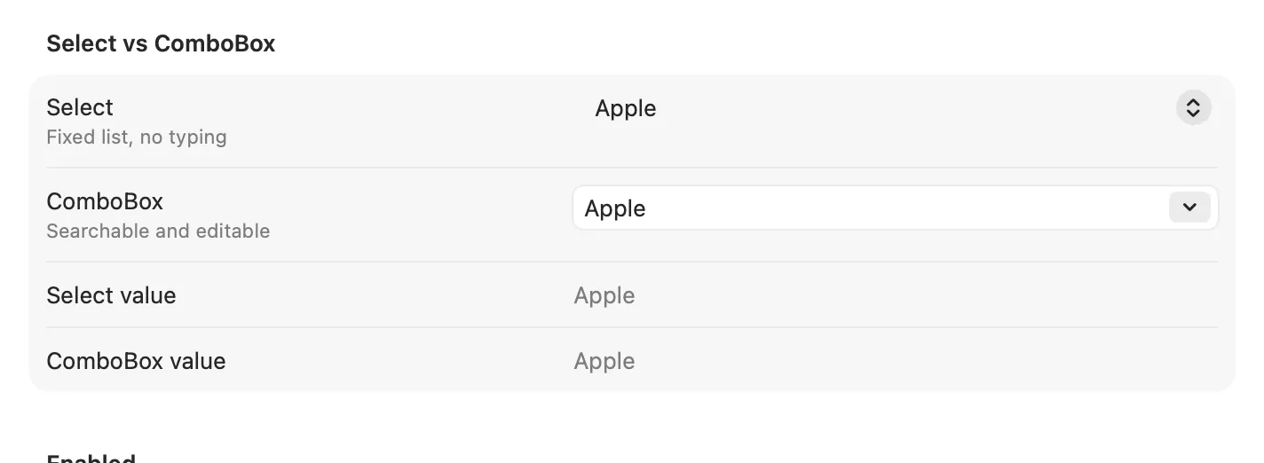
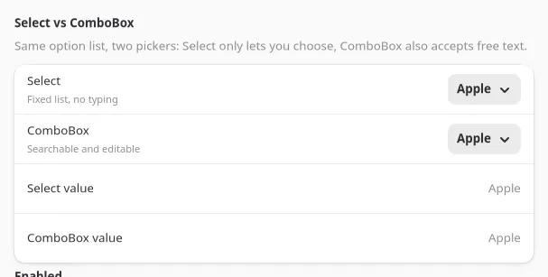
Section titled “ComboBox (<combobox>)”GtkDropDown with enable-search on GTK, NSComboBox on macOS: a dropdown that also accepts
typed, free text, unlike Select, which only picks from the list.
const [text, setText] = useState("Apple");
<combobox options={["Apple", "Banana", "Cherry"]} text={text} onSelectionChanged={(e) => setText(["Apple", "Banana", "Cherry"][e.index] ?? text)} onChanged={(e) => setText(e.text)}/>;| Prop | Type | Applied | Notes |
|---|---|---|---|
options |
string[] | create | |
selectedIndex |
int | createAndUpdate | -1 (or no match) when text doesn’t match an option. |
text |
string | createAndUpdate | The field’s live content, typed or picked. |
placeholder |
string | create | |
editable |
bool | create | false restricts input to the option list, closer to Select. Default true. |
selectionChanged → onSelectionChanged fires { index } when an option is picked from the list.
changed → onChanged fires { text } on every keystroke, picked or typed. Both events can fire
for the same interaction (picking an option updates both the index and the text); keep text as the
source of truth if you only need one.
Breadcrumb (<breadcrumb>)
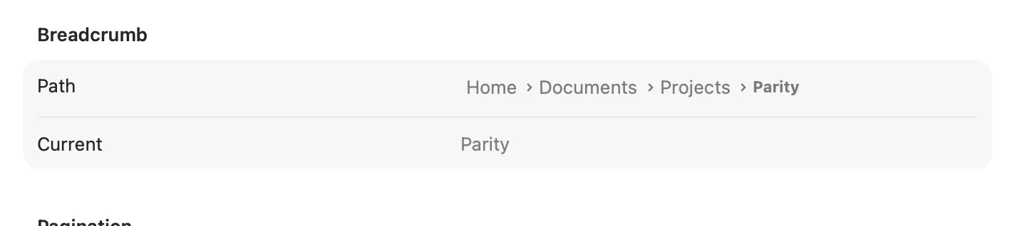
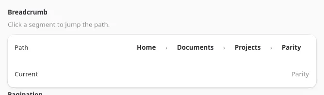
Section titled “Breadcrumb (<breadcrumb>)”A path control (a GtkBox of flat buttons on GTK, NSPathControl on macOS) for a location the user
can click back up: a folder path, a wizard’s completed steps.
const [index, setIndex] = useState(2);
<breadcrumb items={["Home", "Documents", "Projects"]} selectedIndex={index} onItemActivated={(e) => setIndex(e.index)} />;| Prop | Type | Applied | Notes |
|---|---|---|---|
items |
string[] | createAndUpdate | Full path, root first. |
selectedIndex |
int | createAndUpdate | Which segment reads as current. Default -1 (none). |
itemActivated → onItemActivated fires { index } when a segment is clicked. Breadcrumb never
truncates items itself; update the array and selectedIndex together from the handler.
LevelIndicator’s indicatorStyle
Section titled “LevelIndicator’s indicatorStyle”LevelIndicator gained an
indicatorStyle prop: continuous (the existing fill bar, and the default), discrete (fixed
segments), relevancy (a search-score style fill), or rating, which renders as a row of real
stars (a star row on GTK, NSLevelIndicator in .rating style on macOS) instead of a bar.
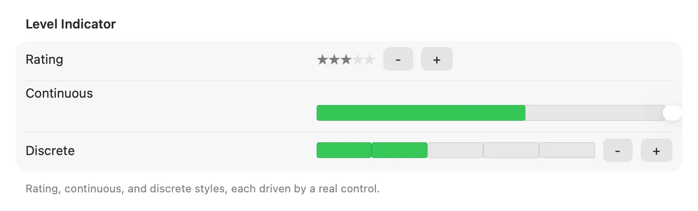
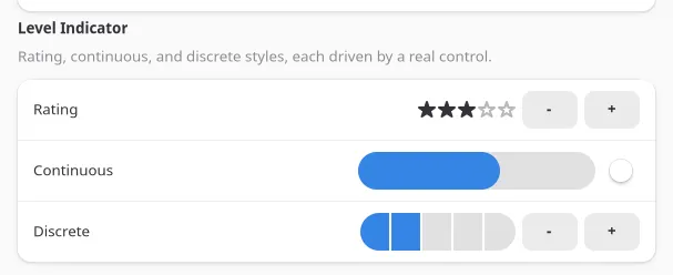
<levelindicator indicatorStyle="rating" min={0} max={5} value={3} />;indicatorStyle is create-only. LevelIndicator has no change event on any style, rating included:
there is no click-to-rate yet. Pair it with real controls (buttons, a slider) that own the value, the
way examples/parity/main.tsx’s Display section does for all three styles.
LevelIndicator stays plain NSLevelIndicator on macOS rather than SwiftUI: it already draws four
distinct system styles (continuous, discrete, relevancy, rating), and SwiftUI has no composable
equivalent for any of them outside a single-value Gauge, so there was nothing to gain from
replacing an already-native control.
The universal tooltip prop
Section titled “The universal tooltip prop”Every widget now accepts tooltip, a plain string shown on hover (gtk_widget_set_tooltip_text on
GTK, view.toolTip on macOS). It is createAndUpdate everywhere, so it can change with app state
the same as any other live prop:
<button iconName="edit-delete" tooltip={itemCount === 0 ? "Nothing to delete" : "Delete"} onClick={deleteSelected} />;There is no separate <tooltip> widget; this is a prop, not a component. See the
Widget Reference for confirmation that a given widget’s generated
prop table carries it.
See examples/parity/main.tsx’s Display, Input, and Navigation sections for all six widgets wired
to live state, and the Widget Reference for the generated prop
tables.