Progress & Loading
Two widgets fill out the progress and loading vocabulary: ProgressCircle for a determinate ring
where a bar doesn’t fit, and Skeleton for a shimmering placeholder while content loads. ProgressBar
and Spinner (linear-determinate and indeterminate) are already covered in the
Widget Reference.
On macOS, ProgressBar and Spinner are SwiftUI ProgressViews, hosted the same way the rest of the
leaf widgets are. Both toolkits custom-draw ProgressCircle, because neither ships a determinate ring:
GTK draws the arc with Cairo, macOS with a trimmed SwiftUI Circle.
ProgressCircle (<progresscircle>)
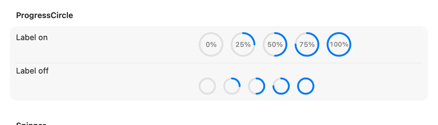
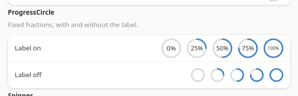
Section titled “ProgressCircle (<progresscircle>)”A determinate ring, custom-drawn on both backends since neither toolkit ships one: Cairo on GTK, a
trimmed SwiftUI Circle on macOS. With showLabel the ring is drawn larger, and the percentage is
scaled to sit inside it.
<progresscircle fraction={0.62} showLabel />;| Prop | Type | Applied | Notes |
|---|---|---|---|
fraction |
float | createAndUpdate | 0–1. Default 0. |
lineWidth |
int | createAndUpdate | Ring thickness in points/px, honoured on both backends. Clamped to a third of the ring’s diameter so the stroke can never close the hole. Default 3. |
showLabel |
bool | createAndUpdate | Renders the percentage as centered text. Default false. |
Display-only, no events.
On macOS, <spinner spinning={false}> hides the indicator instead of leaving a static (non-spinning)
glyph on screen: SwiftUI’s ProgressView has no public API to freeze an indeterminate spinner’s
animation the way AppKit’s NSProgressIndicator.stopAnimation did. GTK still shows a static glyph.
Skeleton (<skeleton>)
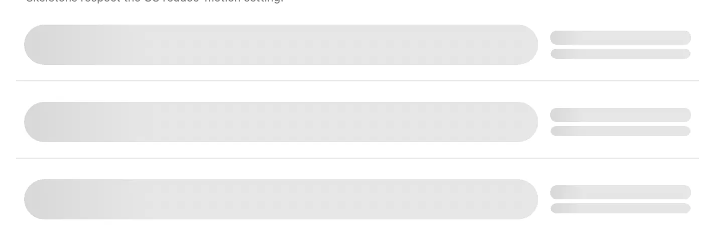
Section titled “Skeleton (<skeleton>)”A shimmering placeholder block for the shape of content that hasn’t loaded yet, sized and rounded to match what it stands in for.

<skeleton width={140} height={14} />;// A circular placeholder, e.g. for an avatar:<skeleton width={40} height={40} radius={20} />;| Prop | Type | Applied | Notes |
|---|---|---|---|
width |
int | createAndUpdate | 0 sizes to the parent instead of a fixed width. Default 0. |
height |
int | createAndUpdate | Default 16. |
radius |
int | createAndUpdate | Corner radius. Default 6; set to half of width/height for a circle. |
animated |
bool | createAndUpdate | Default true. The shimmer stays static under the OS reduce-motion setting regardless of this prop. |
Display-only, no events. Compose several into the shape of the row or card you’re loading, and swap
them for the real content once it arrives. See examples/parity/main.tsx’s Loading section.