Overlays
<dialog> and <sheet> are containers (single child) that mount arbitrary content into a native
modal presentation, rather than prescribing a shape the way showAlert/showAbout do. Both are
controlled by an open prop and report a closed event whenever presentation ends, whether your own
code closed them or the user dismissed them natively.
The AppKit screenshots below show the whole app window rather than just the card, since macOS
presents both as a separate sheet window layered over the app and there is no isolated “just the
sheet” capture to take; GTK’s screenshots crop to the card because AdwDialog presents in-window.
Dialog (<dialog>)
Section titled “Dialog (<dialog>)”A modal window for arbitrary content: AdwDialog on GTK, an NSWindow sheet on macOS.
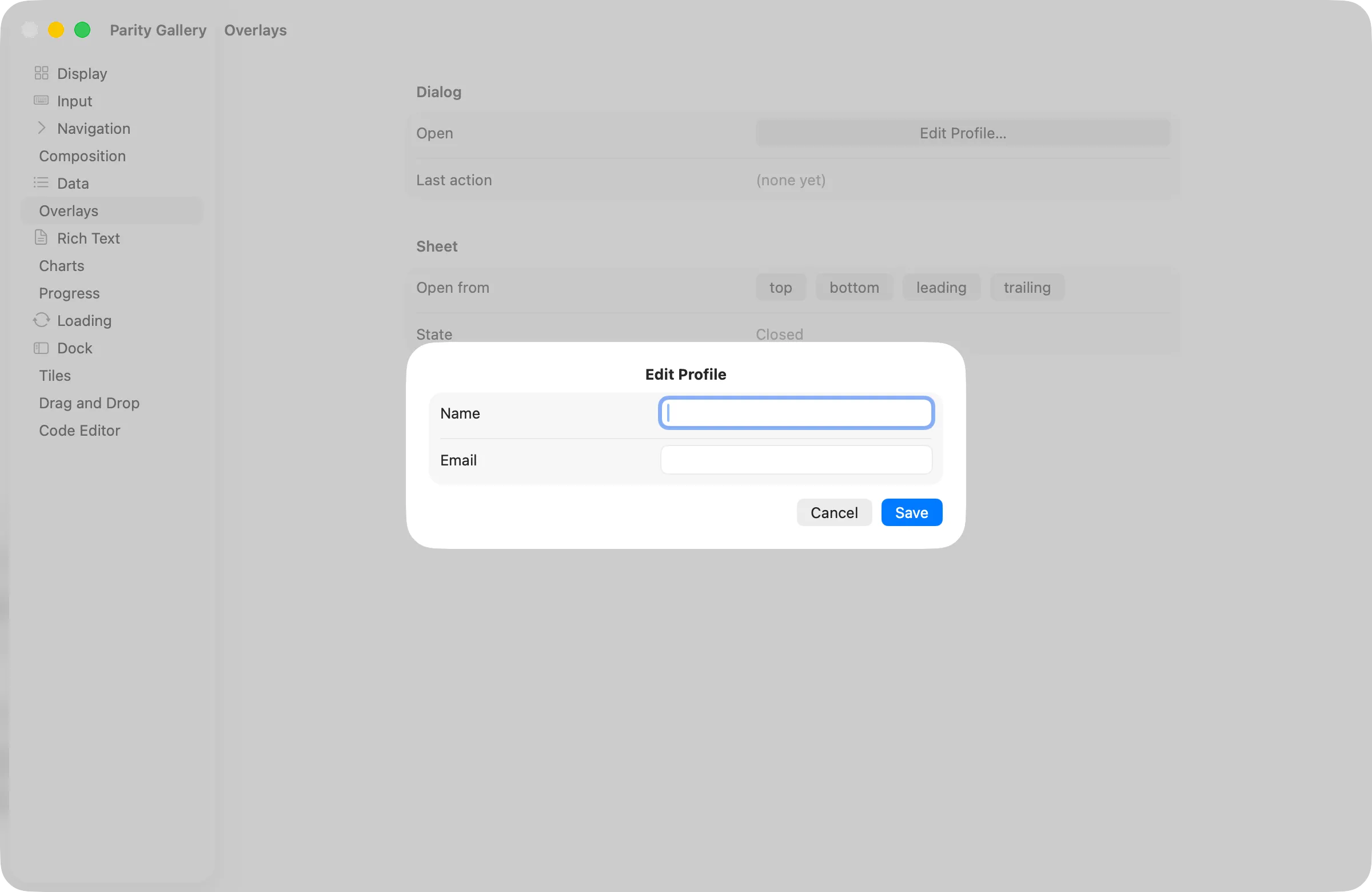
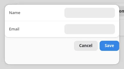
const [open, setOpen] = useState(false);const [name, setName] = useState("");
<dialog open={open} title="Edit Profile" contentWidth={360} contentHeight={220} onClosed={() => setOpen(false)}> <box orientation="vertical" spacing={Spacing.md} style={{ padding: Spacing.lg }}> <textinput text={name} onChanged={(e) => setName(e.text)} /> <button label="Save" onClick={() => setOpen(false)} /> </box></dialog>;| Prop | Type | Applied | Notes |
|---|---|---|---|
open |
bool | createAndUpdate | Controlled visibility. Default false. |
title |
string | createAndUpdate | GTK shows it in the AdwDialog header. macOS draws no titlebar for a sheet, so it is set as a bold headline above your content instead, the way NSAlert lays its own message out. |
contentWidth / contentHeight |
int | createAndUpdate | Default 0, which lets the content size itself. |
closable |
bool | createAndUpdate | Default true. Set false to drop the built-in close affordance and require your own button. |
| Event | Handler | Payload |
|---|---|---|
closed |
onClosed |
none |
closed fires whenever the dialog stops being presented, not only when you set open={false}
yourself. Escape and clicking outside close it natively too. Sync your open state from the handler
so the two can’t disagree.
Sheet (<sheet>)
Section titled “Sheet (<sheet>)”A panel anchored to one edge of the window instead of centered, for a detail pane or inspector that slides in and out. Same container shape as Dialog: single child, your own layout inside.
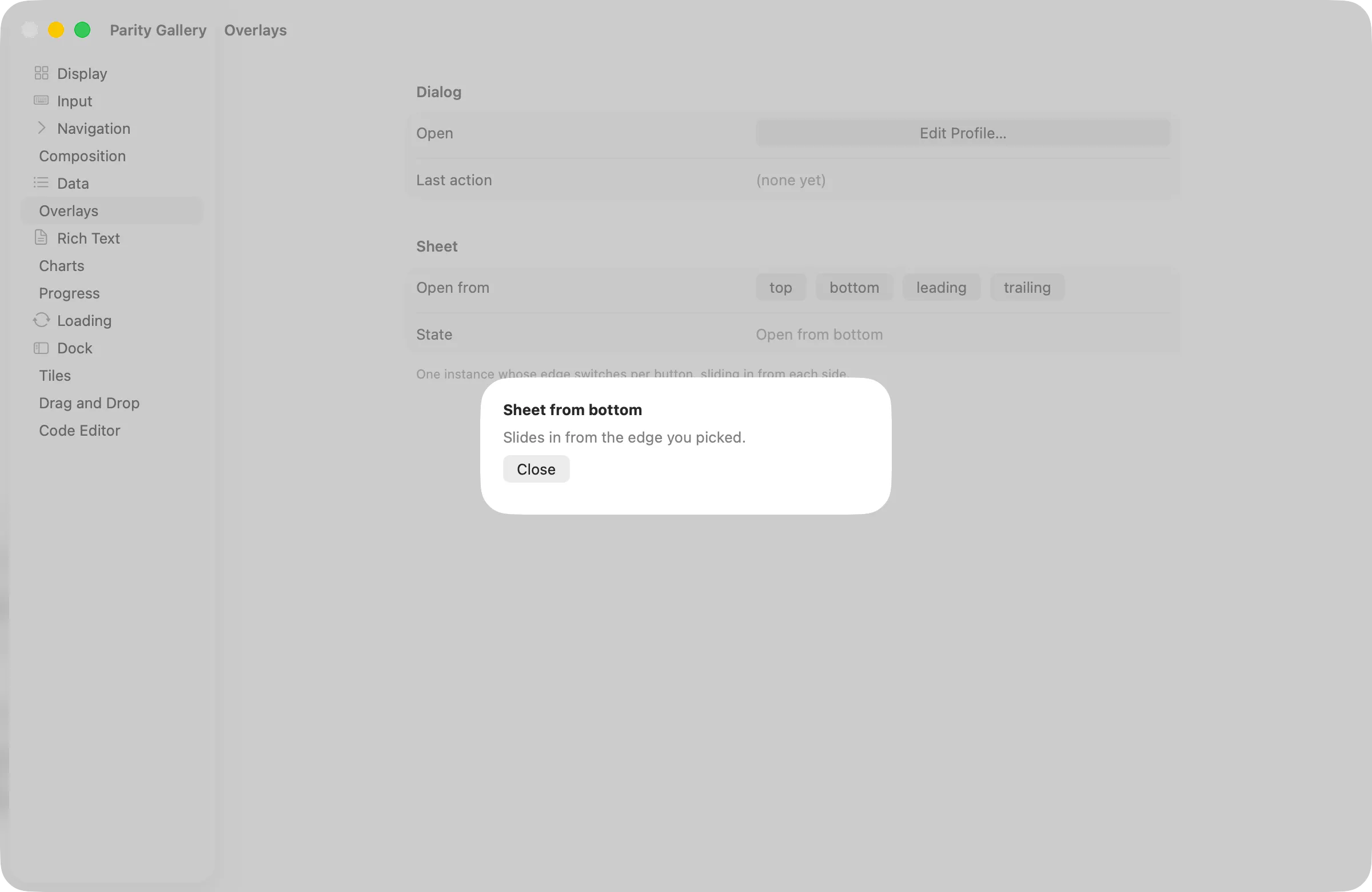
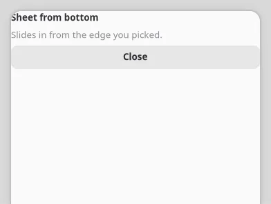
const [open, setOpen] = useState(false);
<sheet open={open} edge="trailing" size={320} onClosed={() => setOpen(false)}> <box orientation="vertical" spacing={Spacing.sm} style={{ padding: Spacing.lg }}> <label text="Details" cssClasses={["heading"]} /> </box></sheet>;| Prop | Type | Applied | Notes |
|---|---|---|---|
open |
bool | createAndUpdate | Controlled visibility. Default false. |
edge |
top | bottom | leading | trailing |
createAndUpdate | Which side it slides in from. Default bottom. leading/trailing follow layout direction rather than literal left/right. Inert on AppKit: macOS presents every sheet from the window’s title bar regardless of this value. GTK honours it with AdwDialog’s bottom-sheet presentation. |
size |
int | createAndUpdate | Thickness on the axis perpendicular to edge: height for top/bottom, width for leading/trailing. Default 320. Inert on AppKit for the same reason edge is: with no edge to anchor to there is no axis for it to measure, so the sheet sizes to its content. |
| Event | Handler | Payload |
|---|---|---|
closed |
onClosed |
none |
edge is still reported back to your app (state, tests) on both platforms; it just doesn’t steer
AppKit geometry. One <sheet> node can serve every edge: change edge on the same node rather than
mounting four separate sheets, as examples/parity/main.tsx’s Overlays section does.
See the Widget Reference for the generated prop tables and
examples/parity/main.tsx’s Overlays section for both wired to state.
Overlay (<overlay>)
Section titled “Overlay (<overlay>)”A z-stack inside the layout, not a modal: GtkOverlay on GTK, a constraint-pinned NSView stack on
macOS. The first child is the content and sizes the overlay exactly as it would size a plain parent;
every later child floats above it without taking layout space. A floating child is positioned by its
own halign/valign style keys (fill, the default, pins both edges of that axis), so a load bar
that must not resize the content below it is one progress bar with valign: "start":
<overlay style={{ hexpand: true, vexpand: true }}> <webview url={url} style={{ hexpand: true, vexpand: true }} /> {loading && <progressbar fraction={progress} cssClasses={["osd"]} style={{ valign: "start", hexpand: true }} />}</overlay>;Layer stacking follows mount order and there is no reorder primitive: a layer inserted mid-list
lands on top. Reach for <dialog>/<sheet> when the content should be modal; <overlay> layers
are part of the page, they just float over it.